BRAND IDENTITY
Simply Bar
We built a cohesive system spanning logo design, brand identity, and packaging that makes each variety instantly recognizable while staying unmistakably Simply Bar. Every pack balances a soft palette with clear hero ingredient callouts, so customers can choose by mood and benefit at a glance.

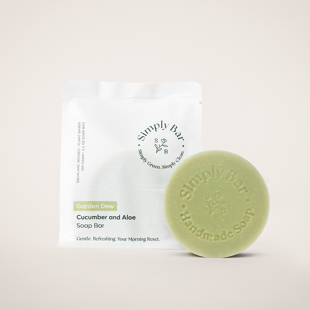
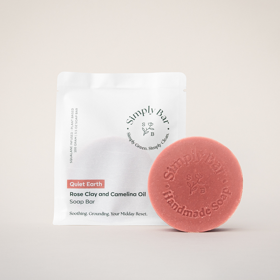
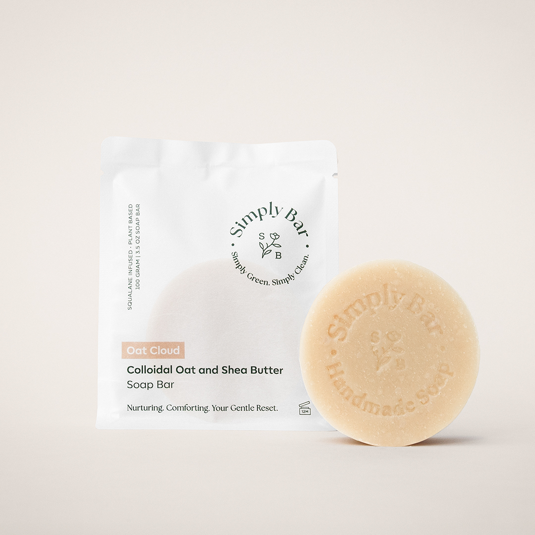
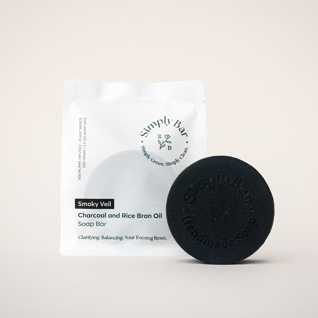
Defining the visual foundation
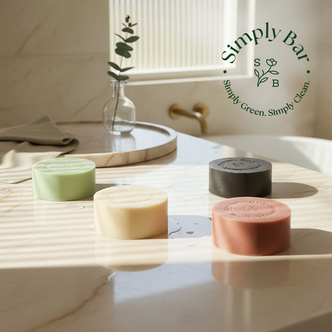
Simply Bar is a premium, squalane infused body soap line designed for people who want a gentler cleanse that still feels elevated. We built the brand identity, packaging system, and imagery to feel calm, modern, and gift ready, pairing minimal design with clear ingredient storytelling and a clean, confident shelf presence.
Building a timeless packaging system
We designed a complete packaging system that feels premium in hand and works in the real world, from discovery and material selection to vendor coordination, print ready templates, and supporting mailer and social assets for launch.
Packaging Discovery and Timeline
We kicked off with a focused two week discovery phase to define the packaging direction, connect with print partners, and evaluate materials that fit the brand and budget. After quick feedback rounds, we moved into a dedicated design week to finalize the packaging and prep it for production.
Choosing The Right Vendors
We worked with proven vendors and order samples to confirm quality upfront. With their input, we finalized dielines, templates, and specs so color, finishes, and assembly were set up for their machines. Then we refined the design through feedback cycles until everything was approved and ready to print.
Beyond Packaging
Designed the supporting system that customers actually touch, including tissue paper, mailer boxes, and postcards that elevate the unboxing experience. We also created social assets and e-commerce ready content to keep the brand consistent across all channels.
